Choosing the right colour combination for your home is one of the most important decisions in house painting. Colours do not just change the look of walls—they affect mood, space perception, brightness, and overall comfort. Many homeowners repaint their homes but still feel something is missing, and most of the time, the problem is wrong colour combination, not paint quality.
In this blog, we will explain how to choose the perfect colour combination for home, room by room, in a simple and practical way. Whether you live in a flat, independent house, or a villa, this guide will help you make confident colour choices that look good for years.
Why Colour Combination Matters in a Home
Colours influence how we feel inside a space. Light colours make rooms feel open and calm, while dark colours add depth and warmth. A good colour combination creates balance between walls, ceiling, furniture, and lighting.
Wrong colour combinations can:
- Make rooms look smaller
- Reduce brightness
- Feel uncomfortable over time
- Make even expensive furniture look dull
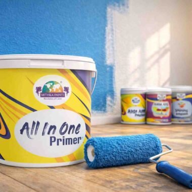
That’s why professional paint brands like Mithila Paints Pvt. Ltd. always recommend planning colours before painting, not during painting.
Understand the Basics of Colour Combination
Before choosing colours, it’s important to understand some basics.
1. Light vs Dark Colours
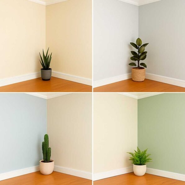
- Light colours (white, cream, pastel shades) make rooms look bigger and brighter
- Dark colours (navy, maroon, charcoal) add richness but can make small rooms feel closed
A balanced combination of light and medium tones works best for most Indian homes.
2. Warm and Cool Colours
- Warm colours: beige, yellow, peach, terracotta – cozy and welcoming
- Cool colours: blue, green, grey – calm and relaxing
Homes usually look best when warm and cool tones are balanced properly.
Consider Home Size and Layout First
Small Homes or Flats
If your home is small:
- Use light colour combinations
- Prefer single colour family with shade variation
- Avoid too many contrast colours
Example:
- Light cream walls + off-white ceiling
- Pastel green walls + white trims
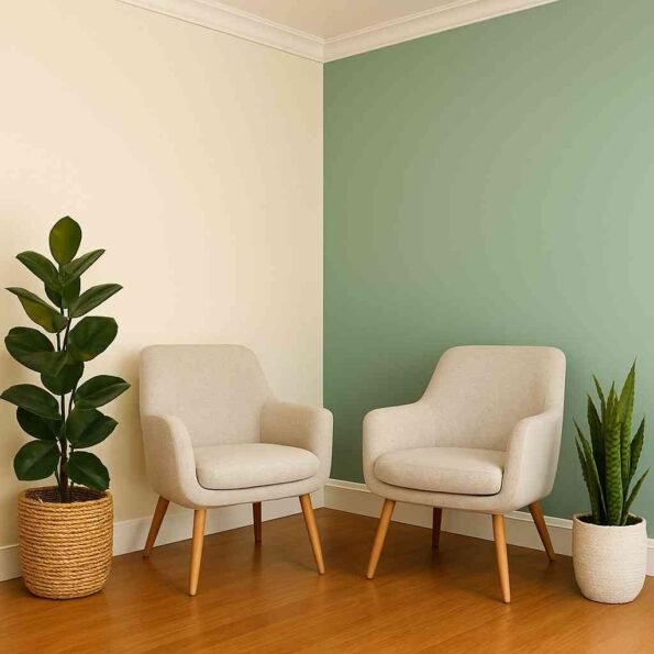
This makes spaces feel open and airy.
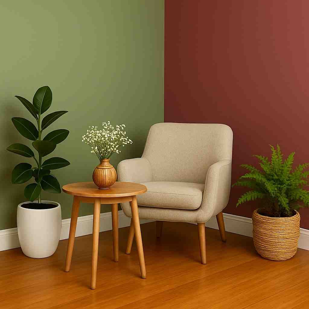
Large Homes or Villas
For bigger homes:
- You can experiment with accent walls
- Darker shades work well in selected areas
- Contrast combinations look elegant
Professional advisors at Mithila Paints Pvt. Ltd. suggest using darker shades only where enough natural light is available.
Choose Colour Combination Room by Room
Each room has a different purpose, so colour choice should match its function.
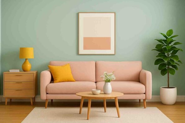
Living Room Colour Combination
The living room is the most visible area of your home.
Best colour ideas:
- Cream + beige
- Light grey + white
- Pastel blue + off-white
- Soft green + ivory
Tips:
- Keep walls neutral
- Add colour through one accent wall or furniture
- Avoid very dark shades on all walls
Living rooms painted with balanced colours look welcoming and timeless.
Bedroom Colour Combination
Bedrooms should feel calm and restful.
Best bedroom colour combinations:
- Light blue + white
- Lavender + grey
- Pastel peach + cream
- Soft green + beige
Avoid:
- Bright red
- Very dark colours on all walls
Experts from Mithila Paints Pvt. Ltd. recommend soothing colours for bedrooms to improve sleep quality and comfort.
Kitchen Colour Combination
Kitchens should look clean and bright.
Ideal colour combinations:
- White + light grey
- Cream + soft yellow
- Pastel green + white
- Beige + light brown
Tips:
- Light colours help reflect light
- Avoid dull or very dark shades
- Washable paints are preferred
Bathroom Colour Combination
Bathrooms face high moisture, so colour choice and paint quality both matter.
Popular combinations:
- White + light blue
- Light grey + white
- Aqua shades + off-white
Light colours make bathrooms look clean and spacious. Using moisture-resistant paint systems is important for durability.
Children’s Room Colour Combination
Children’s rooms should feel lively but not overwhelming.
Good choices:
- Pastel yellow + white
- Sky blue + light grey
- Soft pink + cream
Avoid very bright colours on all walls. Balance fun colours with neutral shades.
Match Colours with Furniture and Flooring
Wall colours should never be selected alone.
Consider:
- Sofa colour
- Curtains
- Wardrobe finish
- Flooring tiles
For dark furniture:
- Use light wall colours
For light furniture:
- Medium or pastel wall colours work well
A good colour combination enhances furniture instead of fighting with it.
Importance of Natural and Artificial Lighting
Lighting changes how colours look.
- North-facing rooms appear cooler
- South-facing rooms receive more sunlight
- Yellow lights make colours look warmer
- White lights make colours look sharper
Always test paint shades under actual lighting before final painting. Mithila Paints Pvt. Ltd. recommends sample testing to avoid colour mismatch.
Choose Colours Based on Indian Climate
Indian homes face:
- Strong sunlight
- High humidity
- Seasonal changes
Light and breathable colours perform better long-term. Very dark shades fade faster in high sunlight.
Use the 60-30-10 Colour Rule
This simple rule helps create balance:
- 60% – Main wall colour
- 30% – Secondary colour (furniture or accent wall)
- 10% – Highlight colour (decor items)
This rule is widely used by interior designers and paint professionals.
Avoid Common Colour Combination Mistakes
Many homeowners make these mistakes:
- Choosing colours from catalogue only
- Ignoring lighting conditions
- Using too many bright colours
- Not considering furniture
- Skipping sample testing
Avoiding these mistakes saves time, money, and repainting costs.
Trend vs Timeless Colour Choices
Trendy colours look attractive but may not age well.
Timeless colours include:
- White
- Cream
- Beige
- Soft grey
- Pastel shades
You can add trend through cushions, curtains, or décor instead of wall paint.
Role of Paint Quality in Colour Appearance
Even the best colour looks bad if paint quality is poor.
Good paint:
- Gives uniform shade
- Enhances colour depth
- Lasts longer
- Resists fading and stains
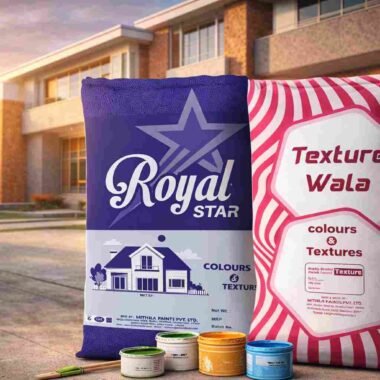
That’s why choosing a reliable paint manufacturer like Mithila Paints Pvt. Ltd. ensures your selected colour combination looks beautiful for years.
Final Tips Before Finalizing Colour Combination
Before painting:
- Shortlist 2–3 combinations
- Test sample patches on walls
- Observe for 24 hours
- Check colour in morning and night
- Finalize only after satisfaction
Conclusion
Choosing the right colour combination for home is a mix of science, practicality, and personal taste. When colours are selected based on room size, lighting, furniture, and purpose, the home looks balanced and comfortable.
By following the tips shared in this guide and using quality paint solutions from Mithila Paints Pvt. Ltd., you can create a home that feels welcoming, stylish, and long-lasting—without regret.