
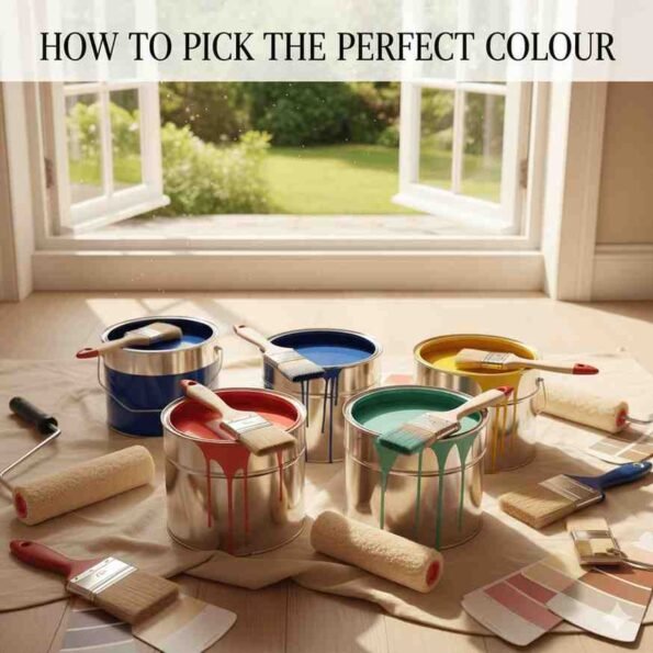
Discovering Your Home’s Best Colour Story
Choosing the best colour for your home can feel like an overwhelming task. With an endless spectrum of hues and shades, where do you even begin? This isn’t just about picking a pretty shade; it’s about crafting an atmosphere, enhancing your space, and reflecting your personal style. The right colours can transform a small room into an airy sanctuary or a drab hallway into a vibrant welcome. Conversely, the wrong choices can make a space feel cramped, cold, or simply “off.”
Many homeowners agonize over paint swatches, afraid of making an expensive mistake. But what if there was a systematic way to approach colour selection, turning anxiety into excitement? This comprehensive guide will equip you with the knowledge, tips, and confidence to unlock the best colour palettes for every room, ensuring your home truly feels like you. We’ll delve into the psychology of colour, the impact of light, the power of existing elements, and practical testing methods, helping you confidently pinpoint the best colour for each unique space. Forget fleeting trends; our focus is on timeless strategies that lead to lasting satisfaction and the truly best colour choices. Let’s embark on this colourful journey to finding your home’s signature look and the best colour combinations that resonate with your lifestyle.
1: Understanding the Psychology of Colour – Setting the Mood
- Key Concept: Colours evoke emotions and influence the mood of a room. Understanding this is crucial for choosing the best colour.
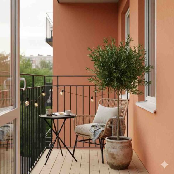
- Warm Colours (Reds, Oranges, Yellows):
- Energy, passion, warmth, intimacy.
- Can make large rooms feel cozier.
- Consider dining rooms, living rooms.
- Cool Colours (Blues, Greens, Purples):
- Calm, serenity, freshness, spaciousness.
- Can make small rooms feel larger and more open.
- Consider bedrooms, bathrooms, offices.
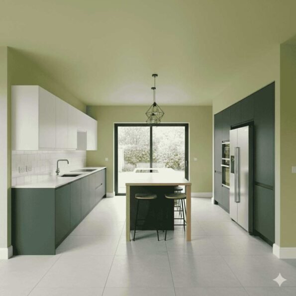
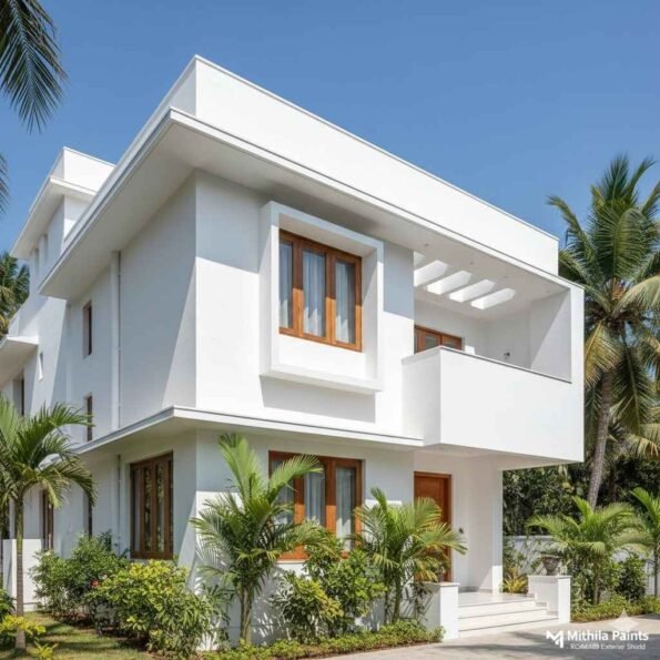
- Neutrals (Grays, Beiges, Whites):
- Versatile, timeless, sophisticated.
- Provide a backdrop for bolder accents.
- Create a sense of calm and balance.
- The best colour for adaptability.
- How to apply: Decide on the desired feeling for each room first, then explore colours within that emotional range. This helps narrow down the best colour options significantly.
2: The Unseen Influence – Natural and Artificial Lighting
- Key Concept: Light is the ultimate colour chameleon. How a colour appears on a swatch can drastically change once on a full wall under different lighting conditions.
- Natural Light:
- North-facing rooms: Cooler, softer light. Often makes colours appear muted or grayish. Warm colours can help balance this.
- South-facing rooms: Bright, warm, intense light. Colours appear truer and brighter. Cool colours can help temper the warmth.
- East-facing rooms: Warm, bright morning light; cooler in the afternoon.
- West-facing rooms: Cooler morning light; intense, warm afternoon/evening light.
- Artificial Light:
- Incandescent (old bulbs): Yellowish hue, warm.
- LEDs (various temperatures): Can be warm white, cool white, or daylight.
- Warm White: Enhances reds, oranges, yellows.
- Cool White/Daylight: Enhances blues, greens, whites.
- Fluorescent: Can cast a cool, sometimes greenish, tint.
- Practical Tip: Always test paint colours in the actual room, on large swatches, and observe them at different times of day and under all types of lighting used in that space. This is critical for finding the best colour.
3: Harmonizing with Existing Elements – A Seamless Approach
- Key Concept: Your home isn’t a blank canvas. Furniture, flooring, artwork, and architectural features are all existing colour cues that should inform your new paint choices.
- Starting Points:
- Area Rugs: Often contain multiple colours, providing a natural palette to draw from.
- Artwork: A favourite piece can dictate a room’s entire colour scheme.
- Upholstery: Major furniture pieces (sofas, chairs) are fixed elements; choose colours that complement them.
- Flooring: Hardwood, carpet, or tile all have undertones that need to be considered.
- Cabinetry/Countertops: Especially crucial in kitchens and bathrooms.
- Architectural Features: Exposed brick, stone, or unique trim.
- Undertones are Key: Look beyond the main colour. Does your beige sofa have a pink or green undertone? Does your wood floor lean orange or brown? Matching these subtle undertones is how you achieve a cohesive and sophisticated look and select the best colour.
- Creating Flow: Consider adjacent rooms. How do colours transition from one space to the next? Aim for harmony, not necessarily uniformity.
4: The Power of Contrast and Accent Walls
- Key Concept: Not every wall needs to be the same colour. Strategic use of contrast and accent walls can add depth, draw attention, and define zones.
- Accent Walls:
- Highlight an architectural feature (fireplace, alcove).
- Emphasize a focal point (bed, console table, artwork).
- Add a bold pop of colour without overwhelming the room.
- Often the best colour for an accent wall is drawn from an existing fabric or artwork in the room.
- Contrast in Trim:
- White trim against a coloured wall is classic.
- Dark trim against a light wall creates drama.
- Matching trim to the wall colour can make a space feel larger and more unified.
- Using Colour to Define Spaces: In open-concept homes, different paint colours can subtly delineate areas like dining zones or seating areas.
5: Beyond the Walls – Considering Ceilings and Trim
- Key Concept: Ceilings and trim are integral parts of a room’s overall colour scheme and should not be an afterthought.
- Ceilings:
- Classic White: Reflects light, makes rooms feel taller.
- Tinted Ceilings: A lighter shade of the wall colour creates a cohesive, enveloping feel.
- Dark Ceilings: Can make a room feel cozier, more intimate, or dramatic (especially in high-ceilinged rooms).
- Trim (Baseboards, Crown Molding, Door Frames):
- White: Crisp, defines the room’s edges.
- Matching Wall Colour: Creates a seamless look, good for making a space feel larger.
- Contrasting Colour: Can highlight architectural details or add a decorative element.
- Doors: Often painted the same as the trim, but can be a standalone accent colour.
6: The Testing Phase – Your Best Colour Insurance Policy
- Key Concept: Never commit to a colour based solely on a small swatch. Testing is non-negotiable for finding the best colour.
- Sample Pots/Swatches:
- Purchase sample pots of your top 2-3 choices.
- Paint large squares (at least 2’x2′) on different walls in the room.
- Alternatively, paint large poster boards, leaving a white border. This allows you to move them around.
- Observe and Evaluate:
- Watch the samples at various times of day.
- See how they look under natural light and artificial light.
- Notice how they interact with your furniture and flooring.
- Don’t rush the decision; live with the samples for a few days.
- Undertones Again: Pay close attention to subtle undertones that might emerge on a larger scale. A seemingly neutral grey could suddenly look purple or green. This critical step ensures you find the best colour.
7: Embracing Your Personal Style – Making it Truly Yours
- Key Concept: Ultimately, the best colour for your home is one that you love and that makes you feel good.
- Don’t Fear Your Preferences:
- Are you drawn to bold, vibrant hues or soothing, muted tones?
- Do you prefer traditional, modern, bohemian, or minimalist aesthetics?
- What colours appear in your wardrobe, favourite artworks, or travel photos? These are clues to your inherent colour preferences.
- Gather Inspiration:
- Pinterest, Instagram, home decor magazines, and design blogs are excellent resources.
- Create mood boards to visually curate your ideas.
- Remember, inspiration is a starting point, not a strict blueprint.
- Trust Your Gut: While all the technical rules are important, your personal comfort and joy with a colour are paramount. After all the careful consideration, the best colour choice will feel right to you.
Confidently Painting Your Vision
Choosing the best colour for your home doesn’t have to be a daunting challenge. By understanding the psychology behind hues, considering the profound impact of light, harmonizing with your existing decor, and meticulously testing your choices, you can approach the process with confidence and creativity. Remember that your home is a reflection of you, and the colours you select are powerful tools for self-expression and mood creation.
Whether you’re opting for a calming neutral backdrop, a vibrant accent wall, or a sophisticated deep hue, follow these seven secrets to ensure your choices are informed, intentional, and truly transformative. Step by step, you’ll not only discover the perfect shades but also craft spaces that feel balanced, beautiful, and authentically yours. Embrace the journey of colour, and enjoy the profound impact the best colour can have on your living environment. Happy painting!